border-radius
非固定长宽的长方形,4 个角都是最大程度的 45 度角: border-radius: 10000000px设置一个无限大(至少大于最小边一半长度)的 px 值
省略单位
冷知识: height: 2 和height: 2px的区别是 不加 px,默认单位是em
css 里的函数
如attr(), format()
position: absolute
position: absolute定位有个特点是,尽量收缩大小。通常用于自适应宽高的场景,比如移动端的刘海屏适配
legend 的 css 特性
fieldset & legend 的妙用
https://www.zhangxinxu.com/wordpress/2016/11/html-fieldset-legend-element-css-layout/
<!DOCTYPE html>
<html lang="en">
  <head>
    <meta charset="UTF-8" />
    <meta http-equiv="X-UA-Compatible" content="IE=edge" />
    <meta name="viewport" content="width=device-width, initial-scale=1.0" />
    <title>Document</title>
  </head>
  <body style="width: 100vw; height: 100vh">
    <div style="height: 100px; width: 1; background-color: aqua"></div>
    <div style="position: relative; width: 300px">
      <div style="width: 250px; height: 50px; background-color: blue" />
      <fieldset
        style="
          position: absolute;
          top: -5px;
          left: 0;
          right: 0;
          bottom: 0;
          margin: 0;
          padding: 0 8px;
          overflow: hidden;
          /* border: 1px solid #000; */
          border-style: solid;
          border-width: 1px;
          border-radius: inherit;
          pointer-events: none;
        "
      >
        <legend><span>Outlined</span></legend>
      </fieldset>
    </div>
  </body>
</html>
几种布局
Float
Flex
Grid
multiCol
从上到下,从左到右填满column-count: 3; 指定容器内有几列,由浏览器计算出每一列分配多少空间column-width: 200px; 将按照你指定的宽度尽可能多的创建列;任何剩余的空间之后会被现有的列平分
创建的列无法单独的设定样式。 不存在让单独某一列比其他列更大的方法,同样无法为某一特定的列设置独特的背景色、文本颜色,
只有两个机会改变列的样式
column-gap: 20px; 更改列间间隙,接受任何长度单位column-rule:4px dotted rgb(79, 185, 227)相当于每列之间的 border(相同属性值),是 column-rule-color 和 column-rule-style 的缩写这条分割线本身并不占用宽度。它置于用 column-gap 创建的间隙内break-inside: avoid可以强制 item 里的内容不会溢出换列
background
一种常用的全屏滑动,背景固定的布局常用
background-attachment: fixed;
background-repeat: no-repeat;
background-size: cover;
background-position: center center;
回流 reflow 和 重绘 repaint
https://github.com/Advanced-Frontend/Daily-Interview-Question/issues/24
减少重绘与回流
- 使用 transform 替代 top
- 使用 visibility 替换 display: none ,因为前者只会引起重绘,后者会引发回流(改变了布局
- 避免使用 table 布局,可能很小的一个小改动会造成整个 table 的重新布局。
- 尽可能在 DOM 树的最末端改变 class,回流是不可避免的,但可以减少其影响。尽可能在 DOM 树的最末端改变 class,可以限制了回流的范围,使其影响尽可能少的节点。
- 避免设置多层内联样式,CSS 选择符从右往左匹配查找,避免节点层级过多。比如
div > a > span - 将动画效果应用到 position 属性为 absolute 或 fixed 的元素上,避免影响其他元素的布局,这样只是一个重绘,而不是回流,同时,控制动画速度可以选择
requestAnimationFrame(自带函数节流功能,采用系统时间间隔,保持最佳绘制效率,不会因为间隔时间的过短,造成过度绘制,增加页面开销,也不会因为间隔时间过长,造成动画卡顿,不流程,影响页面美观。) - 避免使用 CSS 表达式
expression(js statement),可能会引发回流。
css3 contain 控制重排和重绘
https://juejin.cn/post/6958990366888607757
requestAnimationFrame
工具
- CodePen:代码演示 很多 CSS Demo
- Caniuse:浏览器兼容性
- CssTriggers:CSS 触发
- CubicBezier:贝塞尔曲线
- Flexbox:Flex 布局
- StatCounter:浏览器统计
技术博客
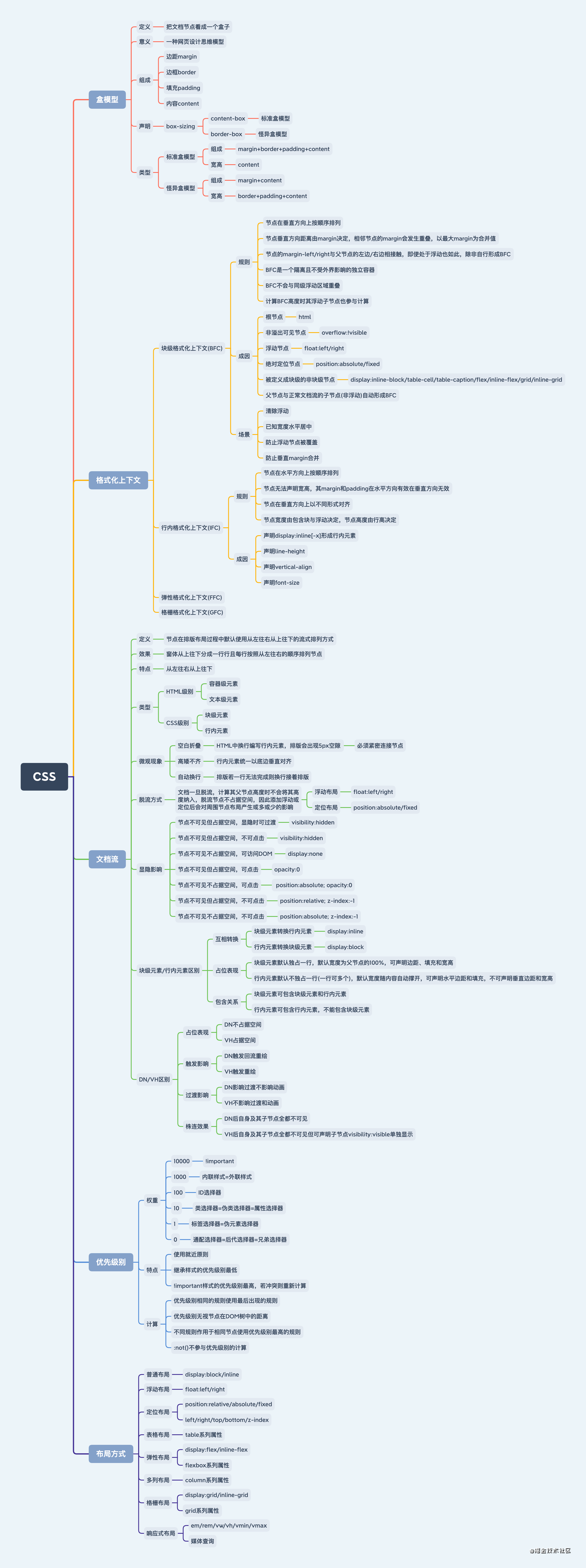
css 粗略思维导图
掌握 CSS 核心知识点:盒模型、格式化上下文、文档流、优先级别、布局方式
由 reflow&repaint 引申的 硬件加速
https://juejin.cn/post/6844903597772111886
https://juejin.cn/post/6844903649974435854
https://juejin.cn/post/6889226357851553805
type=number 的 input, 隐藏上下箭头
input[type=number]::-webkit-inner-spin-button,
input[type=number]::-webkit-outer-spin-button {
  -webkit-appearance: none;
  margin: 0;
}
子元素自动撑开父元素的宽度
https://segmentfault.com/q/1010000012208202
/* 父元素 */
display: inline-block;
/* white-space: nowrap; */